The Top 15 Landing Page Trends That You Must Apply Now To Boost Your Conversions

Are you frustrated with the low conversion rate of your landing page?
The landing page of your business is your biggest opportunity to seal the deal by impressing your prospective customers. But this is also the decision point where your visitors may lose interest and leave.
Either way, it takes just one click!
So, If you are about to create your next big landing page to convert more visitors to customers and see your sales go through the roof, you need to get yourself acquainted with the top landing page trends.
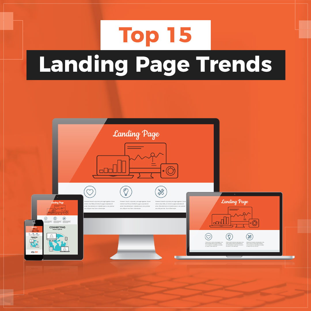
Here are the top 15 trends and tips that you must apply now to boost the conversion rate of your landing page.
Let's dive in!
Interactive copy and personalized design
Want to grab the attention of your visitors?
Nothing can work better than interactive copy. Address the customer directly. Write as if you are writing only for the person who is reading the content right now.
Also, your landing page must be designed to create an interactive experience where users are an active participant with your site. This is done by adding interactive content like short quizzes, interactive infographics and questions with choices that personalize the user experience.
Such interactive content grabs the reader's attention and increases their engagement and time on your page. And this is exactly what a modern landing page must aim for!
Moreover, your landing page should be personalized based on the user's information as hyper-personalization never fails to attract attention. You can use a tool like https://sellitpics.in to do this..
Concise and conversational text
Customers do not like to be sold! But you're here to sell! So, what to do?
Proceed with natural communication!
A natural communication that addresses the key requirements of the users in a convincing manner.
Accordingly, businesses are shifting from purely promotional website content to a much more personalized version that is crafted like an in-person conversation.
Use of video content
Nowadays no one likes to read long pieces of content! Instead why not use a short video to explain the long piece of content in an interactive & engaging way?
Useful and to-the-point videos can go a long way in making your landing page more convincing and compelling.
Short explainer clips with a product/company overview can deliver key information in a faster and more engaging manner as opposed to written content. As a result, videos attract more attention and leave a greater impact on the minds of your audience.
What's more? Videos can also be optimized for search engines, hence helping you rank even higher in search results.
Social proof
This is a psychological phenomenon where people assume that the actions of most other people is the appropriate one in a given situation.
Wouldn't you prefer a software with the highest ratings and positive reviews over the rest?
Of course you would!
You can leverage this phenomenon in your landing page by including positive customer reviews, case studies and major client names at strategic locations on the site.
Vibrant color scheme with shadow effects
It's always a good idea to go for a vibrant and eye-catching color scheme for your landing page!
But you must also make sure that it matches with your brand's value propositions and audience preferences.
Moreover, you may add drop shadows in order to add a depth to page elements and create a 3D effect that gives an illusion of a world beyond the webpage. Such shadow effects increase the aesthetic appeal of the page while improving user experience by providing emphasis to specific elements.
Playful imagery
Playful imagery is another landing page design trend you should check out. As the name suggests, playful imagery includes lots of line-heavy animations, abstract elements, and a liberal use of bold colors.
You can even go a step ahead and mix 3D effects and animations with your product images. Such imagery is perfect if you sell creative products/services as it helps your page to stand apart and engage the audience.
Landing page cards
This is an aesthetic method of organizing page content within uniform boxed areas that resemble cards. It's certainly a great solution tool to differentiate, highlight, and organize your content.
You should certainly apply this popular landing page trend to provide a more convenient and straightforward experience for your audience.
Minimalism
Minimalism in web design stems from the philosophy of ''less is more''. This means that you only keep essential elements while using more blank space on your page.
Why?
A minimalistic design helps to highlight the elements that are of key importance without distracting the visitor with excessive content. So, you must focus on maintaining a balance between minimalism and promotional content.
Custom Illustrations
Custom illustrations are another popular landing page trend that allow you to fully customize the visuals of your landing page.
Unlike images, custom illustrations will help you to demonstrate ideas and processes with complete precision that no camera can capture! You can also adjust such illustrations easily to fit the tone and image of your brand over time.
The possibilities are endless!
Parallax scrolling and Animated page elements
Animated page elements help you create a dynamic visual experience for visitors in a strategic manner.
Animations are perfect for drawing focus to key sections and elements while enhancing the viewer's interest in the page.
Have you noticed websites where the background and foreground elements of a page move at different speeds?
This parallax scrolling technique is another innovative method to create a dynamic and exciting experience in contrast to traditional scrolling.
Priority on Core web vitals
The fast loading, stability and responsiveness of your landing page is now a crucial search ranking factor with Google's Core Web Vitals update.
The three primary areas of user experience considered as Core Web Vitals are-
- Page loading performance
- Ease of interaction
- Visual stability of the page
Hence, your page must be correctly designed and optimized to achieve a high search engine result page ranking and traffic.
Mobile optimization
Browsing on smartphones and tablets accounts for more than half of all internet traffic.
However, businesses have traditionally made landing pages for desktop users first and then made them mobile-friendly by adjustments.
It is over the last few years that the focus is shifting to designing landing pages for mobile-first and then optimizing it for the desktop experience.
Given that most of your traffic will come from mobile devices, it is indeed important to prioritize mobile devices while designing a modern landing page.
Guided tours and chatbots
Creating a guided experience of your web page for new visitors is always a good idea! Such guided tours are especially effective if the interface is complex and users may find it tough to figure it out themselves.
Everyone likes some guidance when things get tricky!
Chatbots are another great way to simplify the customer experience by kickstarting real conversations with website visitors. By simulating a live customer service agent, chatbots encourage visitors to explain what they are looking for, hence allowing you to give them exactly what they need.
Naturally, both guided tours and chatbots can significantly boost your conversion rate and sales when applied correctly.
Free tools and facilities
As competition continues to rise, the battle to differentiate your page from other websites is becoming more and more challenging. A modern strategy that many businesses have started using in this regard is to create free software tools.
These free tools provide relevant and useful functionalities and can be either downloaded or used directly through their website.
Such tools will attract people back to your page repeatedly and may also be used to directly capture new leads. Isn't that great?
Creative value proposition
The value proposition format on a standard landing page is just a headline, followed by a sub-headline and then a Call To Action.
But modern businesses are becoming increasingly creative with their value propositions. To reap this latest landing page trend, you can bring in new elements like social proof, playful imagery, videos and free tools with your CTA.
This would take your proposition to the next level by swiftly convincing visitors to proceed towards favorable actions.
Conclusion
These trends will surely help you to boost your conversions and sales, but that's only if you apply them correctly. And this is where using the best landing page builder tools can make a world of difference!
I would recommend going for an affordable funnel building tool like CloudFunnels that will build the most modern and aesthetic landing pages for you with just a few clicks!
So, it's time to go ahead and apply these latest landing page trends to level up your landing page and give the much needed boost to your conversions and profits
Do you have something to add? Comment below and let us know your ideas!

