5 Important Things You Must Know About Google’s ‘Mobile First’ Requirement
Posted May 7, 2018
|
By Cyril Maithily Gupta
By now, we all know about Google’s ‘Mobile-First’ move. Before getting into the nitty-gritty as to what exactly this new idea is, let’s first have a short discussion on this interesting term ‘Mobile-First’ - quite a relatable terminology, right!
We literally are preferring our mobiles first in any given situation. Before we go to take a nap, we check our mobiles first; before getting into an important meeting we prefer to have a glance at our mobiles first, even to know what time it is, we check our mobiles first!
Everyone is spending more time using Internet on their mobile phones, then they use it on their PC, so yes, Google wants you to optimize your content with mobile phone as the primary target.
What does Mobile-First mean
‘Mobile-First’ simply means your websites must be more mobile-friendly than desktop-friendly. Google will now be ranking your website according to how it appears on mobile’s interface. Earlier it never used to matter as to how or in what manner your website looks on any mobile but now it will. So, if your website’s content isn’t mobile-oriented yet, you need to pull up your socks and get started with it.
In other words, the content of your website should appear exactly the same on mobile as on desktop. The websites should be responsive on mobiles or else they might get indexed at a much lower position by Google.
Understanding it with an example
A quick example of how contents should look on desktop and on mobile:

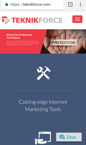 With the above illustration we understand that it is necessary that when someone switches to mobile to view a website, viewer’s experience should be the same as desktop. If a website does not prioritize its mobile version, it is likely that it may experience a fall in its ranking or may have a negative impact on its viewership.
Reason why Google has taken up this step
A candid explanation to this would be that Google wants to offer the best user experience possible.
Internet began on the computer but now most users are on mobile phone and Google wants to serve users to their best capability. That’s why they want to rank websites that look good on mobile phones higher.
It’s logical after all. If the visitor is on the mobile phone, they expect and want content that they can experience properly. Google has to work with their audience’s choices.
When is Mobile First Going Live
It’s on now, and if you aren’t compatible today, get cracking.
Coming to what this article aims at. 5 important things that you need to know to cope up with ‘Mobile-First’ concept
With the above illustration we understand that it is necessary that when someone switches to mobile to view a website, viewer’s experience should be the same as desktop. If a website does not prioritize its mobile version, it is likely that it may experience a fall in its ranking or may have a negative impact on its viewership.
Reason why Google has taken up this step
A candid explanation to this would be that Google wants to offer the best user experience possible.
Internet began on the computer but now most users are on mobile phone and Google wants to serve users to their best capability. That’s why they want to rank websites that look good on mobile phones higher.
It’s logical after all. If the visitor is on the mobile phone, they expect and want content that they can experience properly. Google has to work with their audience’s choices.
When is Mobile First Going Live
It’s on now, and if you aren’t compatible today, get cracking.
Coming to what this article aims at. 5 important things that you need to know to cope up with ‘Mobile-First’ concept
 4. Speedy Website:
Make your website faster. Put up smaller sized images so that they load quickly. Try eliminating characters which aren’t required from the source code. Use browser cache to store in details of the visitors each and every time. This will enable the website to open faster.
5. Optimizing your local searches is also important:
Devices like mobiles and tablets are with a person almost at all times. Therefore, customers wanting local information will obviously login to their mobiles rather than on a PC. So, it is crucial to optimize your website for local searches as well. For this, you can include your name, address and phone number so that your visibility increases while a local person is looking something related to your forte.
To avoid hassles later on, start gearing up now. Buckle-up and make your website a mobile-oriented one. Times have changed and smaller devices are ruling the era.
The more you get adjusted to them, the better you survive in the market. As we can see Google too has now pitched in and has a changed perception, you too should.
If you are of the opinion that the ‘Mobile-First’ move won’t affect you and it isn’t for you, then you may want to re-think. Give your website what it takes to make it mobile-friendly or it might hit you hard.
4. Speedy Website:
Make your website faster. Put up smaller sized images so that they load quickly. Try eliminating characters which aren’t required from the source code. Use browser cache to store in details of the visitors each and every time. This will enable the website to open faster.
5. Optimizing your local searches is also important:
Devices like mobiles and tablets are with a person almost at all times. Therefore, customers wanting local information will obviously login to their mobiles rather than on a PC. So, it is crucial to optimize your website for local searches as well. For this, you can include your name, address and phone number so that your visibility increases while a local person is looking something related to your forte.
To avoid hassles later on, start gearing up now. Buckle-up and make your website a mobile-oriented one. Times have changed and smaller devices are ruling the era.
The more you get adjusted to them, the better you survive in the market. As we can see Google too has now pitched in and has a changed perception, you too should.
If you are of the opinion that the ‘Mobile-First’ move won’t affect you and it isn’t for you, then you may want to re-think. Give your website what it takes to make it mobile-friendly or it might hit you hard.
With the above illustration we understand that it is necessary that when someone switches to mobile to view a website, viewer’s experience should be the same as desktop. If a website does not prioritize its mobile version, it is likely that it may experience a fall in its ranking or may have a negative impact on its viewership.
Reason why Google has taken up this step
A candid explanation to this would be that Google wants to offer the best user experience possible.
Internet began on the computer but now most users are on mobile phone and Google wants to serve users to their best capability. That’s why they want to rank websites that look good on mobile phones higher.
It’s logical after all. If the visitor is on the mobile phone, they expect and want content that they can experience properly. Google has to work with their audience’s choices.
When is Mobile First Going Live
It’s on now, and if you aren’t compatible today, get cracking.
Coming to what this article aims at. 5 important things that you need to know to cope up with ‘Mobile-First’ concept
- Spending on making your website responsive might not be a very bad idea:
4. Speedy Website:
Make your website faster. Put up smaller sized images so that they load quickly. Try eliminating characters which aren’t required from the source code. Use browser cache to store in details of the visitors each and every time. This will enable the website to open faster.
5. Optimizing your local searches is also important:
Devices like mobiles and tablets are with a person almost at all times. Therefore, customers wanting local information will obviously login to their mobiles rather than on a PC. So, it is crucial to optimize your website for local searches as well. For this, you can include your name, address and phone number so that your visibility increases while a local person is looking something related to your forte.
To avoid hassles later on, start gearing up now. Buckle-up and make your website a mobile-oriented one. Times have changed and smaller devices are ruling the era.
The more you get adjusted to them, the better you survive in the market. As we can see Google too has now pitched in and has a changed perception, you too should.
If you are of the opinion that the ‘Mobile-First’ move won’t affect you and it isn’t for you, then you may want to re-think. Give your website what it takes to make it mobile-friendly or it might hit you hard.
 Share
Share
Content
Subscribe to our newsletter
We’ll keep you in the loop on our best advice and strategies for social media marketing and growing a small business.
 Back To Homepage
 Got something to say?